
THE ROLE OF TYPOGRAPHY AND PROPER ENGLISH IN EFFECTIVE WEB DESIGN
As websites are increasingly used to showcase products, services and ideas, web design has become an essential aspect of our daily lives. However, web design is more than just creating an appealing web page; it also involves the skillful use of web typography and proper English.
Web typography pertains to the style, arrangement and appearance of text on a webpage. The choice of font style, such as sans-serif, can influence the user’s reading experience. Additionally, using proper English, including correct grammar, spelling and punctuation is crucial in effectively communicating the intended message.
This blog post will delve into the importance of web typography and proper English in web design and how they can affect user experience.
Typography in Web Design
Explanation of Typography
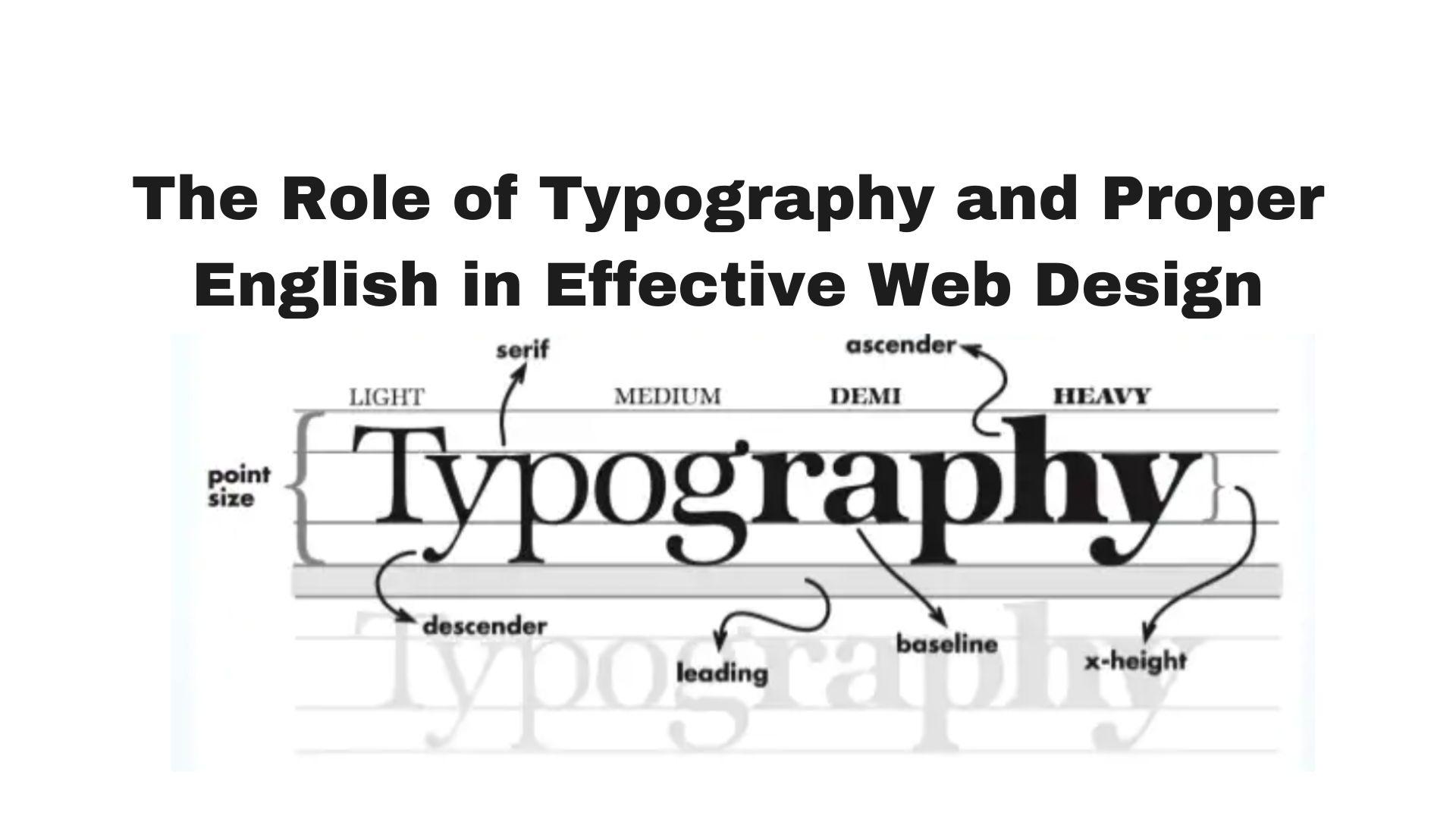
Web typography encompasses the process of designing and organizing text on a webpage. This involves selecting the appropriate typeface, font size, line spacing and other design elements to create text that is visually appealing and legible on digital platforms. Two popular font styles used in web typography are serif fonts and sans serif fonts.
Serif fonts have small decorative lines at the end of each character, while sans-serif fonts lack these embellishments. Choosing between serif and sans-serif fonts is an important decision in web typography, as it can impact the readability and overall style of the web page.
Importance of Typography in Web Design
Typography is important in web design for several reasons:
Readability: Good typography is essential for ensuring that text is legible and easy to read. Web designers can achieve this by selecting appropriate fonts, including Google Fonts and choosing an optimal font size, line spacing and other design elements.
Using a sans-serif font can further enhance the readability of the text. Micro typography, such as kerning and letter spacing, can also make a significant difference in the overall look and feel of the text. By prioritizing good typography in their user interface designs, designers can create an optimal reading experience for their users.
User Experience: Good typography can enhance the user experience by creating a visually appealing design that engages users and encourages them to explore the website further. On the other hand, poorly-designed typography can be a turn-off for users and lead to a high bounce rate.
Branding: The use of typography is instrumental in creating a distinctive brand identity that accurately reflects its values and personality. Employing a consistent approach to macro typography on all marketing materials, including web pages, can help establish a cohesive and easily recognizable brand identity.
Furthermore, selecting the appropriate fonts, such as popular sans serif fonts, serif typefaces and script fonts, along with fine-tuning micro typography, can contribute to achieving this goal.
Accessibility: Typography can play a crucial role in making a website accessible to all users, including those with visual impairments. By using appropriate font sizes, line spacing and contrast, web designers can make the text easier to read for users with different visual abilities.
SEO: In web design, macro typography, which includes font styles, font libraries and line length, plays a crucial role in creating a successful website. One of the key aspects of typography in web design is the use of sans-serif typefaces, which are easier to read on digital screens. Additionally, visual hierarchy is important for organizing information and guiding the user’s eye through the content.
Moreover, typography can also have an impact on a website’s search engine optimization (SEO). Proper HTML tagging and formatting of text can make it easier for search engines to crawl and index the website’s content, ultimately leading to improved search engine ranking and visibility.
Overall, typography is an essential element of web design that can greatly impact the effectiveness and success of a website.
Best Practices for Typography in Web Design
Here are some best practices for typography in web design:
Choose the Right Font: Selecting the appropriate font is a critical consideration for any web designer aiming to create a successful web design. When choosing fonts, the web designer should opt for standard fonts that are easy to read and match the website’s tone and personality. For body text, sans-serif fonts are typically the preferred choice due to their readability on digital screens. In contrast, serif fonts are ideal for headings and subheadings to provide a sophisticated and elegant look.
Fonts can be classified into two categories: decorative and standard fonts. Standard fonts refer to the most commonly used fonts on the web, such as Arial, Times New Roman and Helvetica. These fonts are typically safe options for most web pages, as they are widely available and compatible across different devices.
Typography guidelines recommend using no more than two or three different typefaces per website to avoid visual clutter and maintain consistency. Additionally, using multiple typefaces can make it challenging for readers to focus on the content. Therefore, web designers should strive to strike a balance between readability, visual appeal and consistency when choosing fonts and other design elements.
Limit the Number of Fonts: The use of excessive decorative fonts can lead to a cluttered and unprofessional appearance of a website. It is advisable to limit the number of fonts used to two or three and maintain consistency throughout the website.
The font choice should be made from the same font family, which offers different font weights and other fonts to choose from. Proper typography design takes into account the use of white space, typographic hierarchy and other elements that contribute to the overall graphic design. Typography plays a significant role in creating a visually appealing and effective website and bad typography can undermine the website’s credibility and message.
Use Proper Font Sizes: It is important to use appropriate font sizes for different screen sizes and resolutions in order to ensure readability for internet users. For body text, it is recommended to use a minimum font size of 16px, while headings and subheadings can be larger to create a clear hierarchy of information.
The choice of font type should also be considered to maintain a graphical representation and a balanced UI design. Paying attention to detailed aspects such as graphic balance is crucial, as it affects how the written word is perceived on a computer screen.
These considerations are important not only for UI design but also for the print industry. Remember to use the next line appropriately to maintain a clear and organized layout.
Use Proper Line Spacing: Line spacing or leading, is the distance between lines of text. Use proper line spacing to ensure that the text is easy to read and visually balanced. A line spacing of 1.5 is often recommended for body text.
Use Proper Alignment: Align the text properly to create a visually balanced design. Centered or justified text can be difficult to read, so it is often better to use left-aligned or ragged right text.
Use Contrast: Use contrast to make the text stand out and improve readability. Use a dark font color on a light background or vice versa. Avoid using colors that are too similar or low in contrast.
Use Proper HTML Tags: Use proper HTML tags to format the text and improve search engine optimization. Use H1 tags for main headings, H2 tags for subheadings and so on. Use bold and italic text sparingly for emphasis.
Proper English in Web Design
Explanation of Proper English
Proper English refers to the use of correct grammar, spelling, punctuation and syntax in written communication. It is essential for effective communication and can greatly impact the credibility and professionalism of a website.
Importance of Proper English in Web Design
Proper English is important in web design for several reasons:
Clarity: A website’s message should be conveyed in a clear and comprehensible manner through the use of proper English. This not only avoids any potential confusion or misunderstandings but also ensures a positive user experience. To enhance the website’s design style, it is crucial to use beautiful fonts and maintain sufficient horizontal space for great typography.
The text line should have appropriate line height and prominent headings to draw attention to the website text structure. When treating text, it’s important to choose from among the many fonts available and use them in such a way that legibility is maintained throughout the website’s design. In short, proper English and great typography are essential components of a successful website.
Credibility: Proper English can enhance the credibility and professionalism of a website. Poor grammar and spelling errors can make a website appear unprofessional and unreliable.
SEO: Proper English can also impact a website’s search engine optimization (SEO) by making it easier for search engines to crawl and index the content. Websites with high-quality, error-free content are more likely to rank higher in search results.
Accessibility: Proper English can also make a website more accessible to users with different levels of English proficiency. Clear and concise language can make the website easier to understand for non-native speakers.
Best Practices for Proper English in Web Design
Some best practices for proper English in web design include:
Use Correct Grammar and Spelling: Use correct grammar and spelling throughout the website to ensure clarity and credibility. Proofread the content carefully and use a spell-check tool to catch errors.
Use Active Voice: Make the writing more interesting and understandable by using active voice. Active voice also tends to be more concise and direct than passive voice.
Use Short Sentences and Paragraphs: Employ small paragraphs and phrases to make the content easier to read and understand. Long, complex sentences can be confusing and overwhelming for readers.
Use Headings and Subheadings: Use headings and subheadings to break up the content and make it easier to scan. Headings and subheadings should be clear and descriptive.
Use Bulleted Lists: Use bulleted lists to highlight important points and make the content more readable. Bulleted lists are also useful for organizing information and improving comprehension.
By following these best practices, web designers can ensure that their content is clear, concise and error-free, which can enhance the user experience and improve the website’s credibility and visibility.
The Impact of Typography and Proper English on User Experience
Typography and proper English can have a significant impact on user experience in web design.
Here are some ways in which they can affect the user experience:
Typography
Readability: Typography can greatly impact the readability of the content on a website. If the typography is difficult to read, users may quickly become frustrated and leave the site.
Brand Identity: Typography can also help to establish the brand identity of a website. A font that is consistent with the brand’s image can help to reinforce the brand and create a more cohesive user experience.
Visual Appeal: Typography can enhance the visual appeal of a website. A well-chosen font and proper use of spacing and alignment can create an aesthetically pleasing design that is more likely to keep users engaged.
Proper English
Clarity: Proper English can greatly enhance the clarity of the content on a website. Clear and concise language can help users quickly understand the message and purpose of the site.
Credibility: Proper English can also impact the credibility of a website. Poor grammar and spelling errors can make a website appear unprofessional and untrustworthy.
Search Engine Optimization (SEO): Proper English can also impact a website’s SEO. Websites with high-quality, error-free content are more likely to rank higher in search results.
Accessibility: Proper English can make a website more accessible to users with different levels of English proficiency. Clear and concise language can make the website easier to understand for non-native speakers.
In summary, typography and proper English are important elements in web design that can greatly impact user experience.
By using best practices for typography and proper English, web designers can create websites that are more readable, visually appealing and trustworthy, ultimately leading to a better user experience.
Conclusion
Effective web design heavily relies on typography and proper English, which can significantly impact the user experience by enhancing readability, brand identity, visual appeal, clarity, credibility, SEO and accessibility.
Adhering to best practices for typography and language usage enables web designers to create websites that are more engaging, trustworthy and accessible to a wider audience, leading to positive user experiences and ultimately achieving the website’s goals of informing, entertaining or selling products and services.
Our company, web247 design, specializes in creating 10-second video clips for businesses that include QR codes linking to landing pages with special offers or promotions to boost sales and drive traffic to the business.
Ready to elevate your online presence? Contact info@web247design.com today to discuss your web design needs and take your website to the next level
Recent Posts
Useful Links
| M | T | W | T | F | S | S |
|---|---|---|---|---|---|---|
| 1 | 2 | |||||
| 3 | 4 | 5 | 6 | 7 | 8 | 9 |
| 10 | 11 | 12 | 13 | 14 | 15 | 16 |
| 17 | 18 | 19 | 20 | 21 | 22 | 23 |
| 24 | 25 | 26 | 27 | 28 | 29 | 30 |
| 31 | ||||||
Related Post:

UNDERSTANDING THE IMPORTANCE OF UX IN WEB DESIGN
UX or User Experience pertains to the overall interaction a user has with a website,
July 23, 2023
No Comments
THE IMPORTANCE OF RESPONSIVE DESIGN IN MODERN WEB DEVELOPMENT
In modern web development, it is crucial to create responsive websites that can adapt to
July 23, 2023
No Comments

THE BENEFITS OF A CUSTOM WEBSITE DESIGN
A custom design can make your website unique and memorable, providing a superior user experience
July 23, 2023
No Comments
HOW TO DESIGN A HIGH-CONVERTING LANDING PAGE
In the modern era of digital marketing, the importance of a well-crafted landing page cannot
July 23, 2023
No Comments
THE ROLE OF TYPOGRAPHY AND PROPER ENGLISH IN EFFECTIVE WEB DESIGN
As websites are increasingly used to showcase products, services and ideas, web design has become
July 23, 2023
No Comments